2026
SpendTool — Admin Mobile Experience
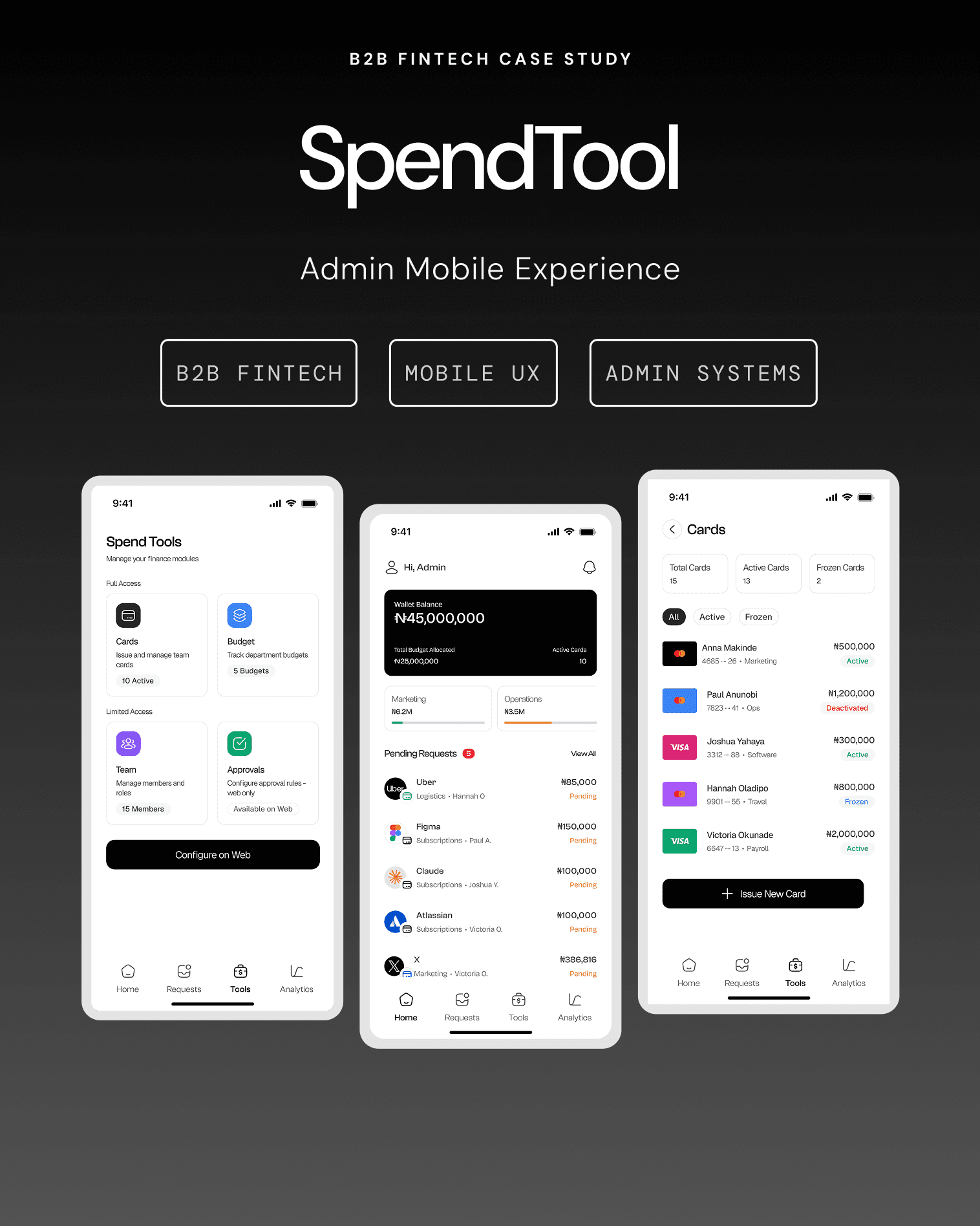
Why spend management—and why the admin side.
Spend management products have a well-documented employee-experience problem: most attention goes to expense submission. The admin side is consistently underserved, even though that is where financial control lives.
The African B2B context sharpens the problem. Corporate-card penetration is lower, teams often share a single card, and the resulting trust, fraud, and control implications are real. SpendTool explores an admin experience from the ground up—mobile first and grounded in that operational context.
The employee spends first, submits later, and policy violations surface after the fact. Control is retrospective.
Limits, restrictions, and budget assignments are configured before a card is used. The card becomes the policy layer.
Setup thinking stays on the web. Mobile exists for the moment something needs the administrator’s attention or action right now.
Requests and approvals look similar but operate at different levels.
Treating Requests and Approvals as interchangeable creates an information architecture that confuses both the administrator and the product logic.
Individual, time-stamped spend events tied to an amount and a person. This is an inbox—urgent and time-sensitive.
The engine that determines who approves what, escalation triggers, and sign-off rules. It is configuration, not an inbox.
Requests therefore earn a permanent bottom-navigation destination. Approval logic appears inside each request as context—such as “Triggered by: Spend above ₦50k rule”—while full workflow configuration remains on the web.
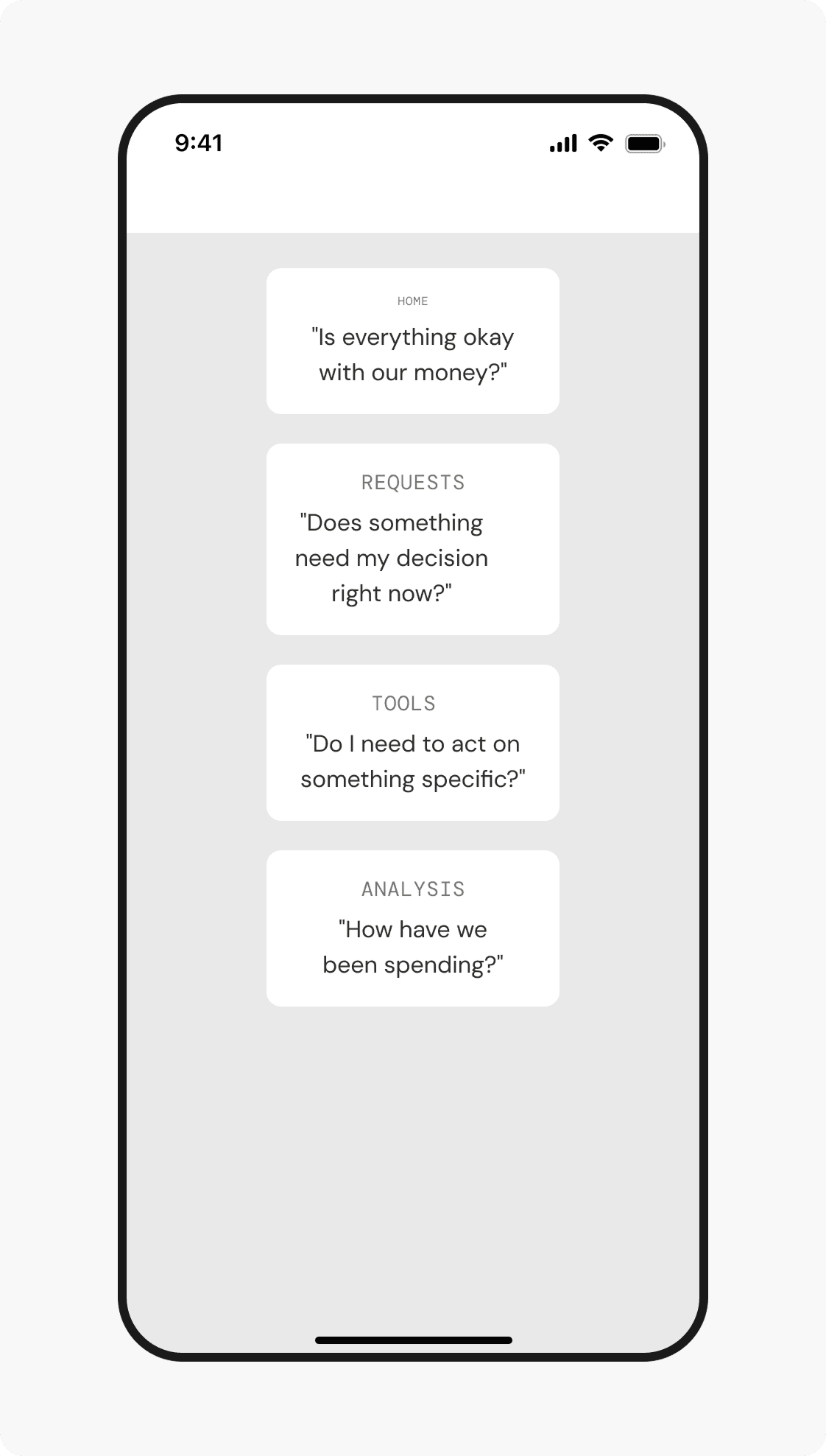
Four tabs, each answering one administrator question.
A question-led architecture
- Home: Is everything okay with our money?
- Requests: Does something need my decision right now?
- Tools: Do I need to act on something specific?
- Analysis: How have we been spending?
Urgency determines the order. Financial health and decisions come first; reflective reporting comes last.
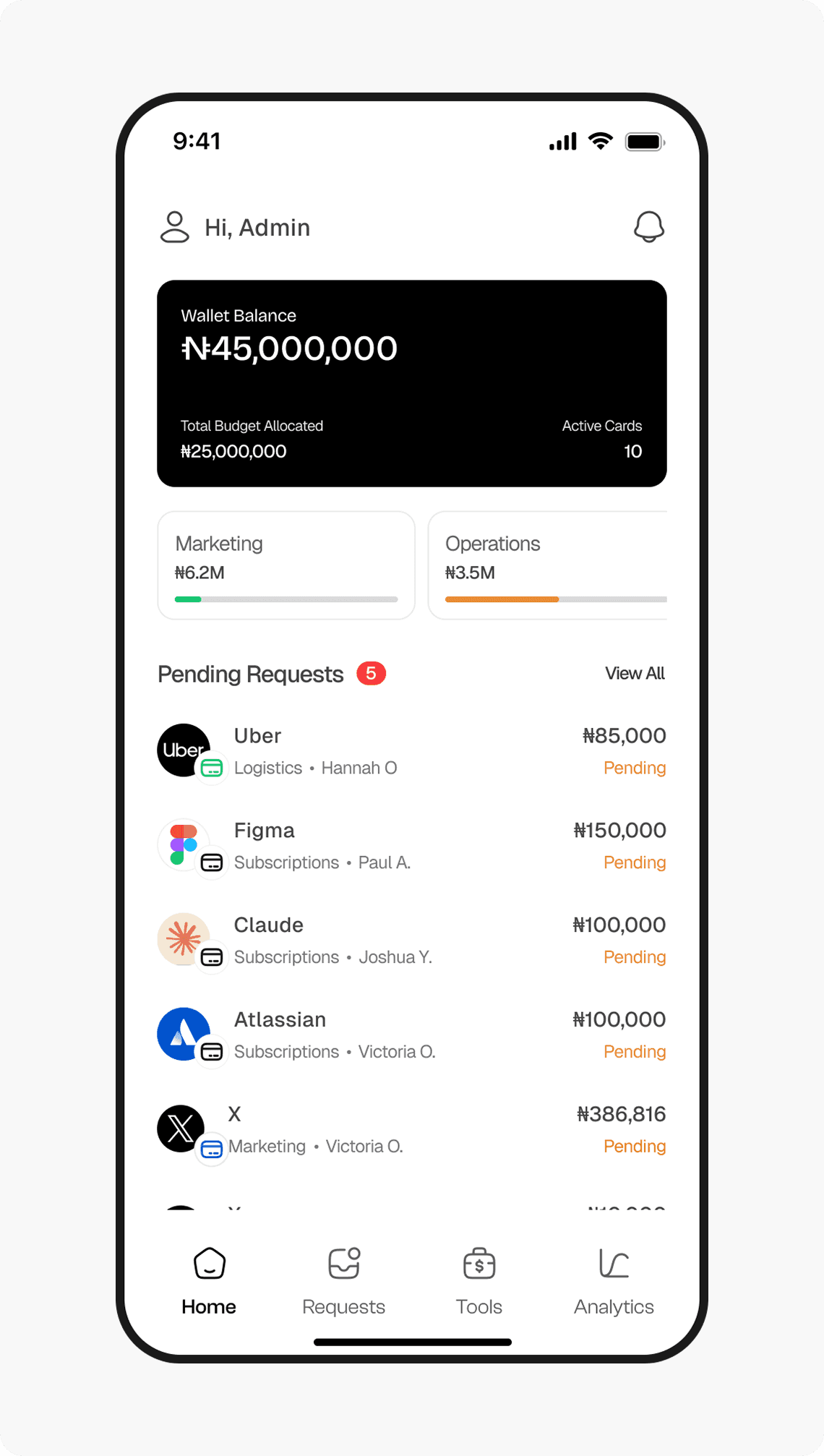
Wallet balance, budget utilisation, and pending work provide financial health in under five seconds.
A transaction inbox that stays one tap away and explains which policy triggered each item.
Cards and Budgets get complete mobile actions; Team is limited; setup-heavy Approval configuration stays on web.
Trend data is valuable but less urgent, so it occupies the final navigation position.
The financial-health view answers one question: is everything okay?
Designed for a five-second read
- Wallet balance: The complete figure is shown while typical balances permit it; abbreviation is reserved for larger scales.
- Budget health: Department budgets use utilisation bars so financial pressure is visible without another tap.
- Pending scope: The request count appears in both the section heading and navigation state.
- No card carousel: Individual cards belong in the Cards module. Home represents organisational health, not inventory.
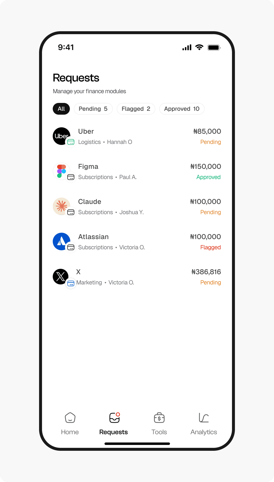
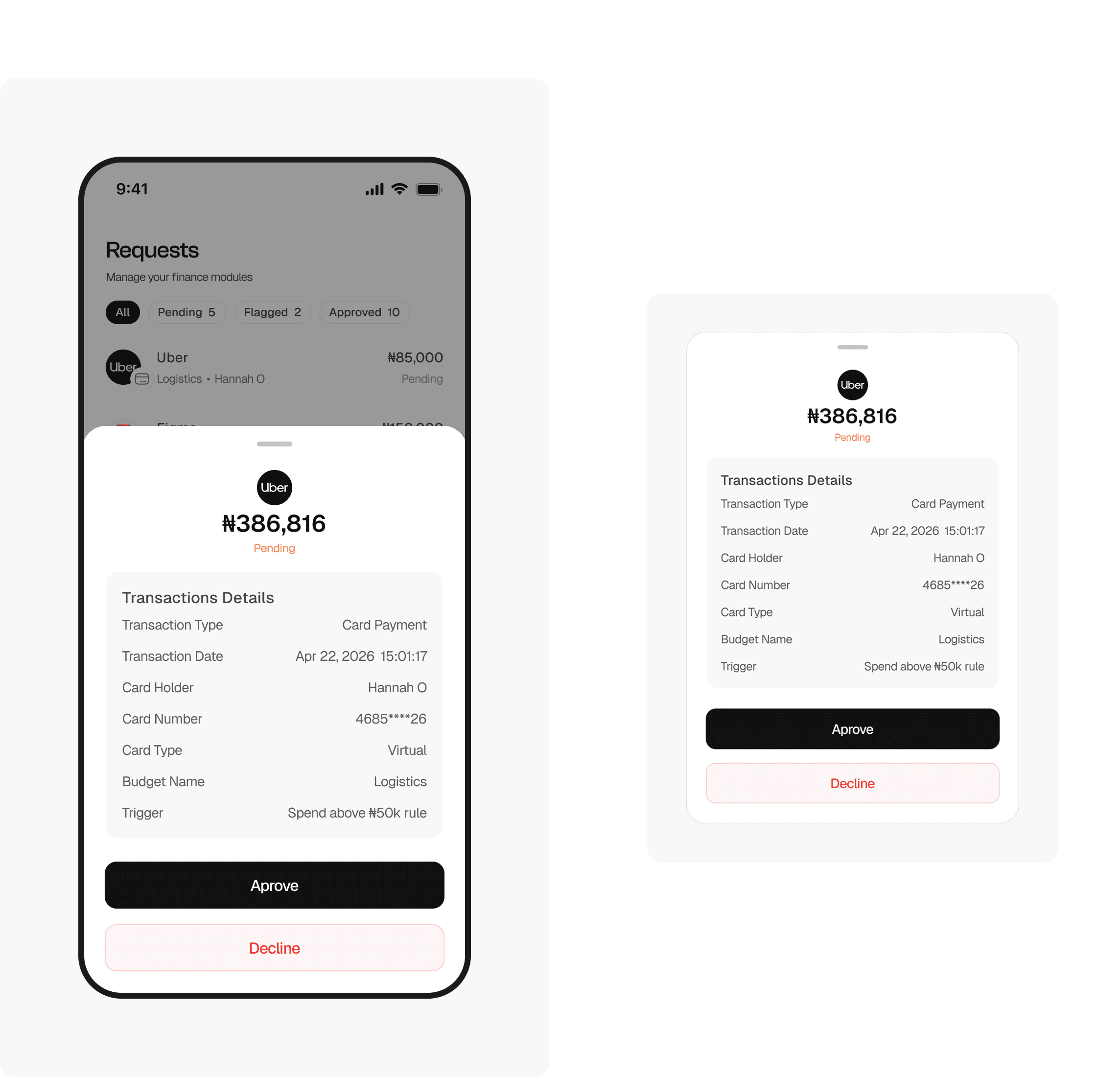
The transaction inbox—not a mobile approvals module.
The rule travels with the request
Every request carries the policy that caused it to appear, so administrators understand why attention is required without opening a separate Approvals module.
Pending items require action. Flagged items require investigation. Approved items remain as historical context. Filter counts communicate the full queue before it is narrowed.
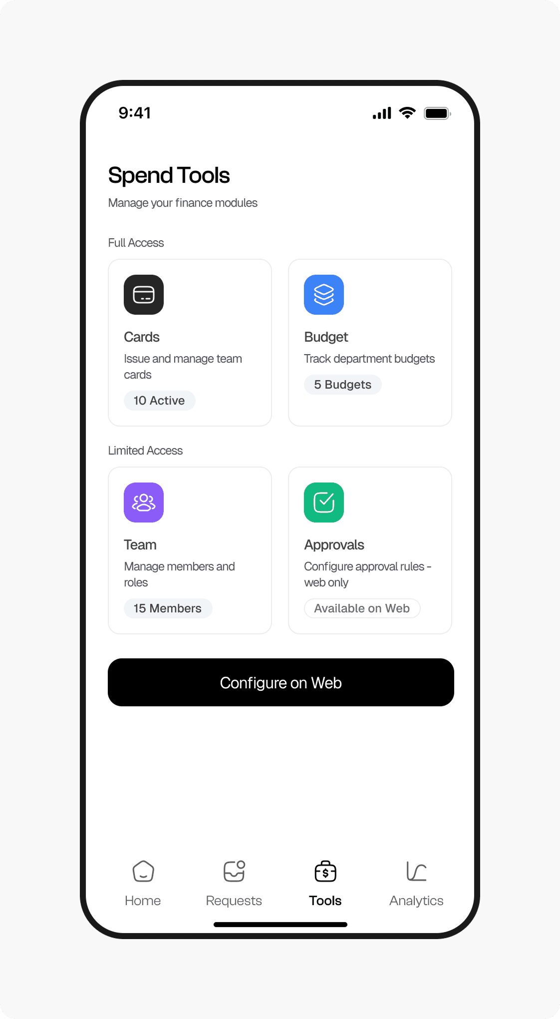
Mobile access is explicit about what it can—and cannot—do.
Two honest tiers
Cards and Budgets provide complete mobile action sets. Team offers limited access for viewing and deactivation. Approval configuration is deliberately labelled as web-only rather than represented by a partial mobile experience.
Live badges communicate what is inside each module before entry, and the web CTA gives setup-heavy work a clear destination.
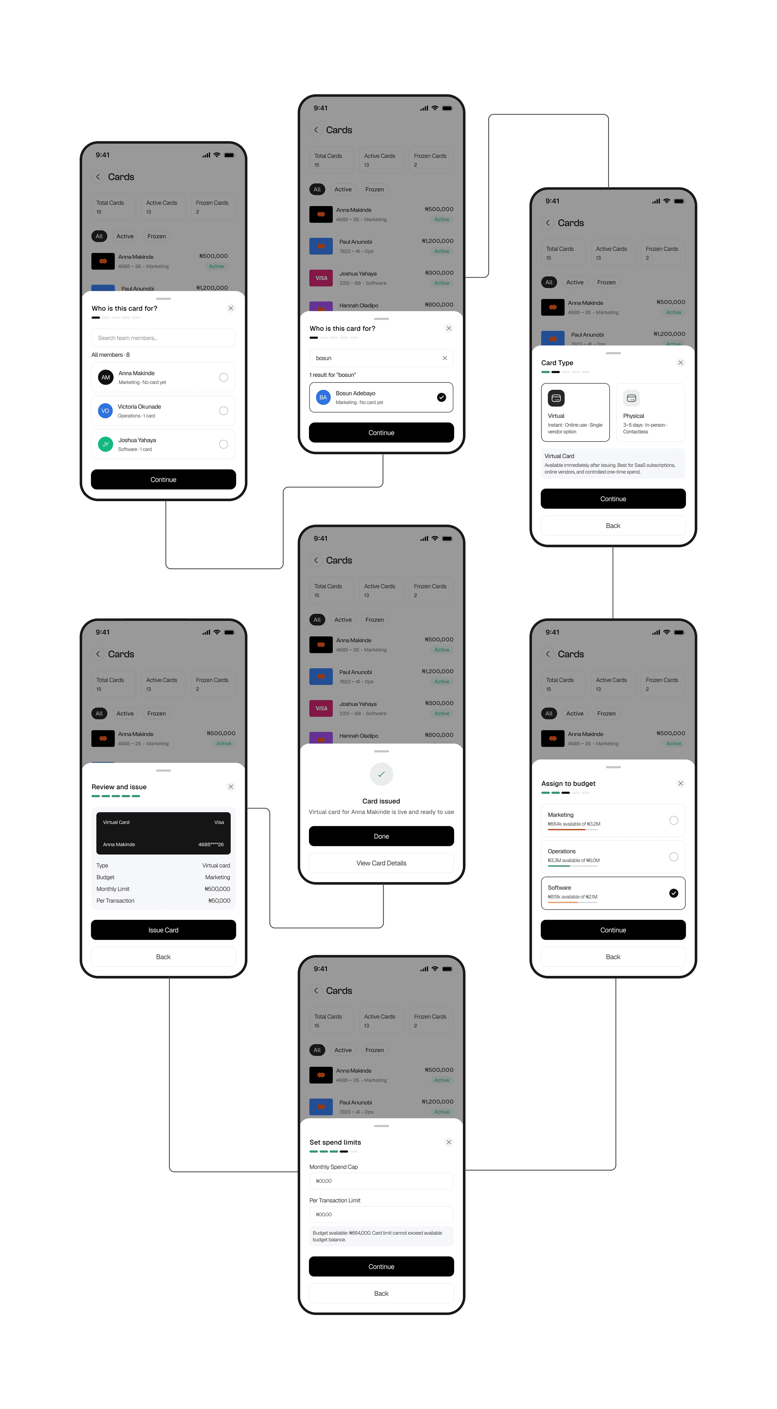
One action becomes five isolated decisions.
Issuing a company card combines identity, card type, budget, spend limits, and final verification. Compressing these decisions into a single form would increase cognitive load and make costly mistakes easier.
Search and filter the team rather than relying on a list that fails as the organisation grows.
Choose virtual or physical with operational differences explained at the decision point.
Assign the card while seeing each budget’s remaining capacity.
Set monthly and per-transaction controls within the available budget balance.
Confirm the complete policy package before issuing the card.
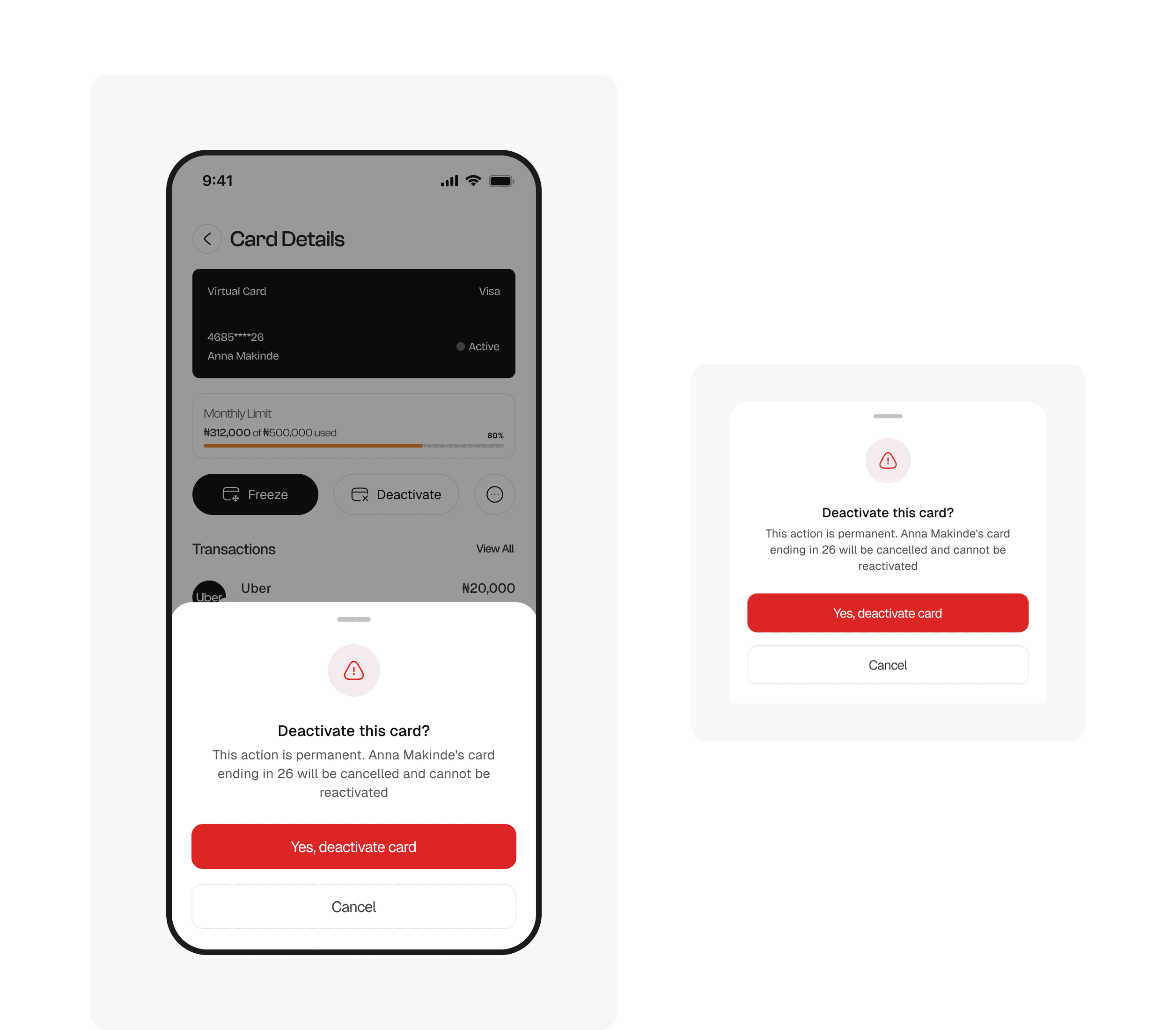
Freeze and deactivate share a row—but carry different weight.
Freeze is a reversible state change; deactivate is permanent. Their interaction patterns need to communicate that difference before the administrator acts.
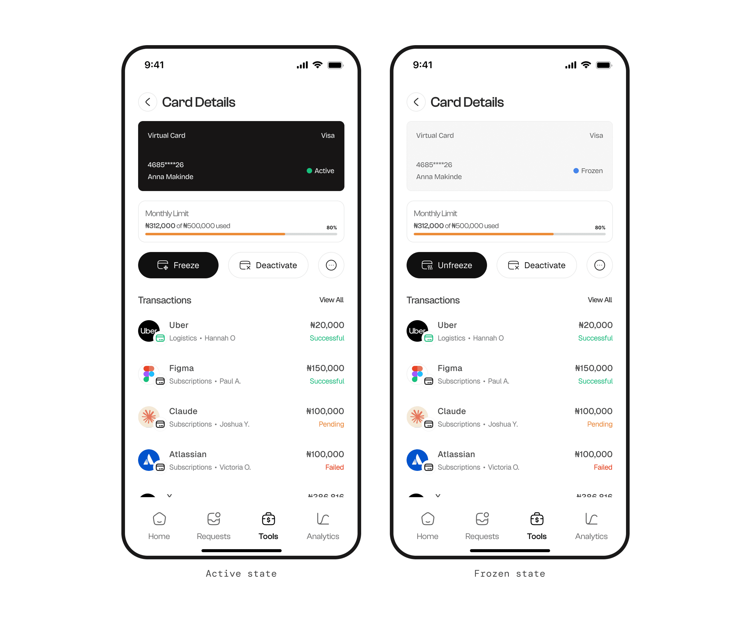
The frozen card is muted and the primary action changes from Freeze to Unfreeze.
Action labels describe exactly what will happen instead of relying on generic confirmation copy.
Deactivation names the cardholder, surfaces consequences, and requires a deliberate second step.
The wallet is the ceiling; budgets are named envelopes.
The wallet establishes the available pool before the administrator considers departmental allocations. Budgets then show usage, remaining value, assigned cards, and paused states as parts of that larger financial system.
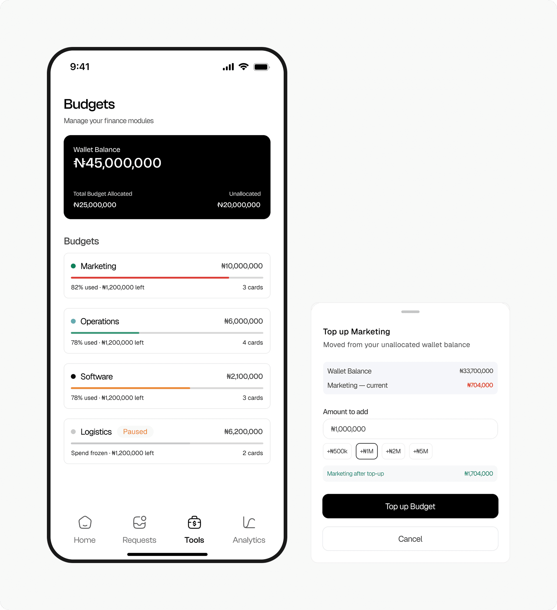
The total pool and unallocated balance establish the administrator’s financial ceiling.
Top-up shows current and resulting balances before money is reassigned.
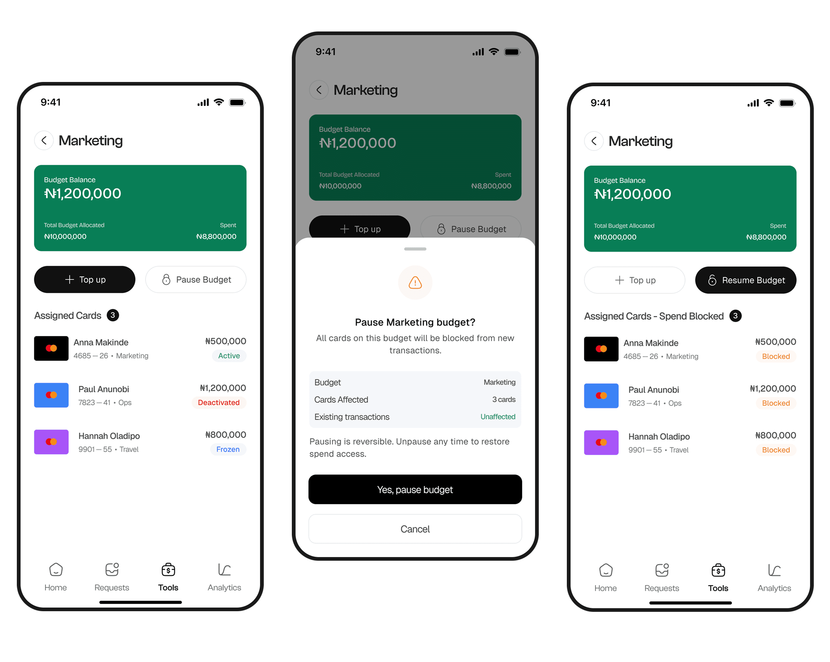
A dimmed budget and explicit badge communicate inactivity before any label is read.
Pause confirmation names how many linked cards will be blocked from new transactions.
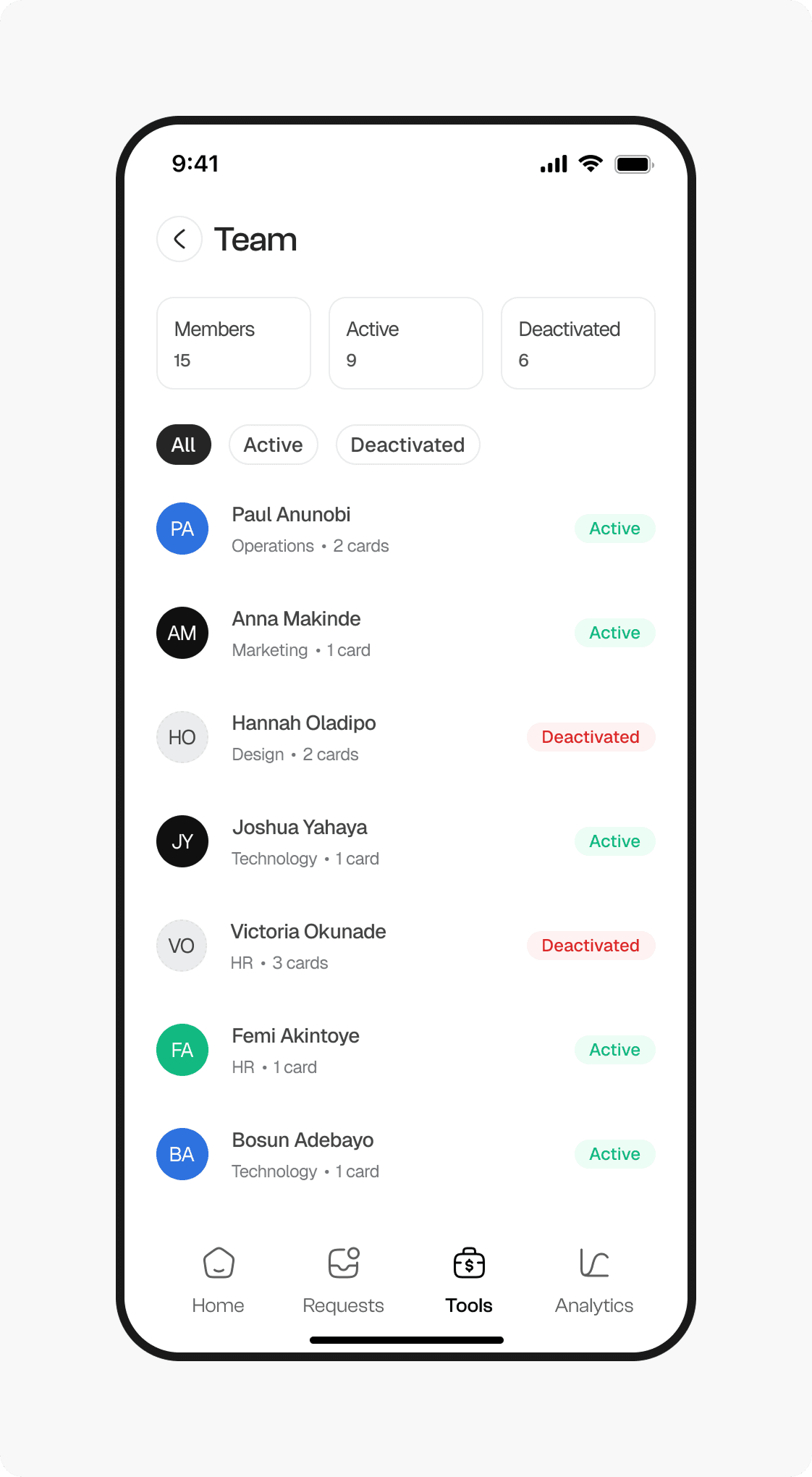
Deactivating a member freezes their card—but does not destroy it.
Separate the person from the financial instrument
Deactivated members become visually distinct through reduced emphasis and status treatment. Member detail exposes linked cards and their current states before an administrator makes another decision.
Deactivating the person freezes their card rather than permanently cancelling it. Permanent card deactivation remains a separate Cards-module action, keeping two different levels of consequence cleanly separated.
The most consequential decisions were structural, not visual.
The work was shaped by questions that precede interface styling: what belongs on mobile versus web, how requests differ from approval rules, and where friction should be removed or deliberately added.
The administrator and employee experiences of the same system are fundamentally different products.
Every feature must justify its presence against an urgent question. If it cannot, it belongs on the web.
Knowing where to add resistance—and where to remove it—is essential in financial product design.
The best fintech UX is not invisible. It is legible—the administrator always knows what state things are in, what they can do, and what will happen when they do it.
Natural extensions include the employee-side mobile experience, a deeper Analysis module, and the full web counterpart where the configuration deliberately excluded from mobile would live.